Broken Dark Font: Adding Raw Texture to Web Design
I was staring at a hero section for a new artisanal coffee brand, and something felt off. The layout was clean, the photography was moody and atmospheric, and the color palette was perfectly desaturated. Yet, the typography felt too safe. The standard geometric sans serif I had chosen was legible, sure, but it lacked the grit and tactile reality of the product itself. This is often the moment in a web design project where you realize that polish isn't always the answer. Sometimes, you need imperfection. That is when I decided to test Broken Dark.
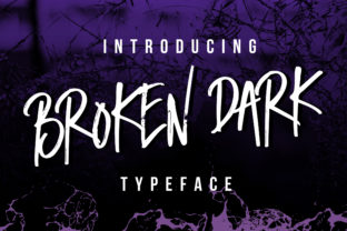
Broken Dark is not your typical script font. While many handwritten typefaces aim for elegant flow or cursive perfection, this twisted script leans into a rough edge that feels distinctly human. As a UI designer, I am usually cautious about bringing distressed textures into digital interfaces because screens can amplify visual noise. However, applying this font to the project revealed how a raw typeface can actually enhance brand trust when used with intention. It stopped looking like a template and started feeling like a story.
Testing Visual Hierarchy in the Hero Section
The first place I introduced Broken Dark was the main headline. In digital design, the hero section has milliseconds to communicate value and mood. I replaced the sterile header with a short, punchy phrase set in this display font. The immediate result was a shift in tone. The jagged edges and irregular baseline created a sense of urgency and authenticity that a smooth serif simply could not achieve.
However, using a creative font in a hero banner requires strict discipline regarding readability. Because Broken Dark has such strong character, I found it worked best when limited to three to five words. Anything longer caused the eye to struggle, especially on smaller laptop screens. The key was treating the font as an image-like element rather than traditional text. It served as a visual anchor that drew attention without demanding prolonged reading time. For the subheadline directly beneath it, I switched to a neutral, high-x-height sans serif to ground the composition and ensure the user understood the offer immediately.
Mobile Responsiveness and Touch Targets
Designing for mobile is where decorative fonts often fail. When I resized the artboard to 375px, the intricate details of Broken Dark risked becoming muddy. To maintain clarity, I adjusted the tracking slightly wider than the default. Tight kerning in distressed scripts can cause letters to bleed together on low-resolution displays or when users have accessibility settings enabled for larger text.
I also avoided using this typeface for interactive elements like buttons or navigation links. In UX design, predictability equals usability. Users expect buttons to look clickable and readable at a glance. Broken Dark is fantastic for setting a mood above the fold, but for call-to-action areas, I stuck to a robust sans serif. This contrast actually made the CTA stand out more effectively against the textured background of the hero area. The lesson here is clear: let the display font do the emotional heavy lifting, but let functional typography handle the navigation.
Strategic Font Pairing for Digital Brands
A standalone script can feel gimmicky, but the right pairing transforms it into a cohesive brand identity system. During this project, I tested several combinations to see what balanced the roughness of Broken Dark without competing with it.
- Geometric Sans Serif: Pairing with a clean, modern sans serif creates a high-contrast editorial look. The mathematical precision of the body copy highlights the organic chaos of the header.
- Traditional Serif: For a more heritage or boutique feel, a classic serif adds sophistication. This combination works exceptionally well for storytelling pages or about sections where you want to evoke tradition alongside raw creativity.
- Monospaced Font: If the brand leans towards industrial or technical aesthetics, a mono font complements the utilitarian vibe of a twisted script. This is ideal for portfolio sites or SaaS landing pages targeting creative professionals.
In my case, the geometric sans serif won out. It provided enough negative space around the dense texture of the header to prevent the page from feeling cluttered. Remember, white space is just as important as the glyph shapes themselves when working with high-detail fonts.
Applications Beyond the Homepage
While the hero section was the primary testing ground, Broken Dark proved versatile across other digital touchpoints. On the product detail pages, I used it sparingly for accent labels like "Small Batch" or "Hand Roasted." These micro-copy moments added texture to the shopping experience without disrupting the scanning behavior required for e-commerce. Users need to quickly find price, weight, and ingredients; the decorative font should only appear where emotion supports the sale.
For social media graphics and ad creatives linked to the site, the font performed brilliantly. On platforms like Instagram or Pinterest, where users scroll rapidly, the rough texture acts as a pattern interrupt. It signals that the content is different from the polished corporate ads filling the feed. Just ensure that any text overlaid on images has sufficient contrast. I often added a subtle dark gradient behind the text when placing Broken Dark over busy photography to maintain WCAG accessibility standards.
Technical Considerations for Web Implementation
Before committing to any premium font for a live website, practical checks are non-negotiable. When integrating Broken Dark into the design system, I verified the licensing terms specifically for web use. Commercial font licenses vary, and ensuring coverage for client projects, online stores, and digital templates protects both the designer and the business owner.
File format matters for performance. I prioritized WOFF2 formats for the web build to keep load times fast. Heavy font files can hurt Core Web Vitals, so I also subsetted the font to include only the characters necessary for the English language and basic punctuation. Unless the project requires multilingual support, stripping out unused glyphs reduces file size significantly.
Additionally, check for OpenType features. Many modern scripts include alternates, ligatures, or swashes that can elevate a design. Broken Dark includes stylistic alternates that allowed me to avoid repetitive letterforms in headlines. Seeing the same 't' or 'e' rendered identically three times in one line breaks the illusion of hand-lettering. Using CSS font-feature-settings to enable these alternates made the digital implementation feel as bespoke as the original type design.
Balancing Aesthetics with User Experience
Ultimately, choosing a typeface like Broken Dark is a strategic decision about brand positioning. It communicates that the brand is unafraid of showing its process, its flaws, and its humanity. In an era of AI-generated perfection and cookie-cutter templates, raw typography signals authenticity. But as web designers, our job is to harness that rawness without sacrificing usability.
The success of this font lies in restraint. It is a powerful spice, not the main course. Use it to punctuate your design, to create focal points, and to inject personality into sterile layouts. Test it rigorously on real devices, not just in design software. Check it against dark mode and light mode preferences. Ensure it scales gracefully from a 27-inch monitor down to a budget smartphone. When you respect the medium as much as the aesthetic, Broken Dark becomes more than just a twisted script; it becomes a vital tool for building memorable, resonant digital experiences.